FROM COMPLEX structures TO APPROCAHABLE Data
Frontend tools
Colorworks
Version:
0.4-Beta-1
0.4-Beta-1
Demo:
Na (Under construction)
Na (Under construction)
License:
FWSoftware license
FWSoftware license
Colorworks
Colorworks sprung out of another project where I wanted to be able to style the user interface of the application.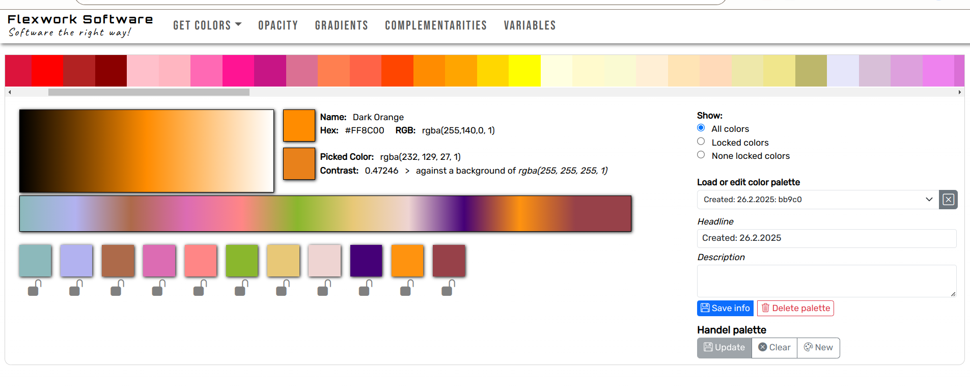
Click images to enlarge

The HTML specification includes a set of named colors that can be used in any webpage or CSS-related color scheme. Colorworks utilizes these colors as base colors for creating derivative colors. This is done by choosing a base color, which will then appear on the large canvas below. Here, the color will create a gradient that transitions from black to the base color and then to white.
You can then use the color picker to choose a color from the gradient. The selected color will appear below the second canvas, which shows a gradient between the chosen colors. You can again use the color picker to find colors between two selected colors.
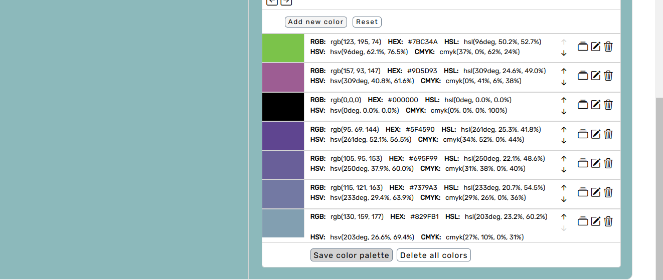
All the chosen colors can be seen below the second canvas. Here, you can lock colors so they cannot be deleted. On the left side of the screen, you can choose to view all colors, locked colors, or unlocked colors. Regardless of the colors you choose, the second canvas will adjust the gradient to match the active colors, allowing you to create new colors between two or more arbitrary colors.
Finally, you can save the palette for future use.
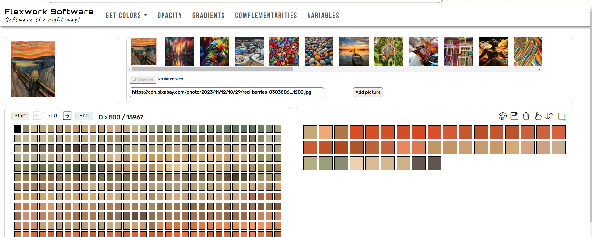
Another way to create color palettes is by selecting colors from images. Here, you upload a picture, and the application presents the colors of each pixel. The pixels are displayed on the left side of the screen. If you click on a colored square, it will be added to the color palette on the right.
You can select an entire row of colors by holding down the CTRL key and clicking on two colors. This action will add all the colors between the start and end colors to the color palette.
At the top of the left box, you can set how many pixels you want to display at the same time. You can then navigate through all the pixels of the image, seeing only pixels with different colors to avoid having to sift through pixels that have the same color value.
You can upload pictures and add them to your picture gallery. Then you can load each picture and add pixels to the same color palette. You can also create a new color palette.
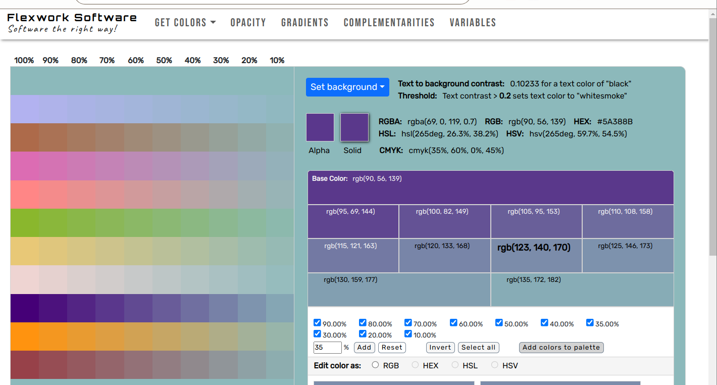
After saving your palettes, you can create derived colors from the palette by using a range of opacity values for each color. On the left side of the screen, you can see all the colors in the palette with opacity added in increments of 10%. To the left, you have the color at 100% color, meaning there is no transparency. To the right, you have the color at 10% color, indicating a 90% transparency level.
On the right side of the screen, you can manipulate the color. First, you can set the background color using the same colors as those in the palette. Now, the colors in the color palette will be a mix of the original color and the background color based on the level of transparency.
Edit Solid Color
By clicking on one of the colors from the color palette on the left side, you can add it to the right side for editing. The two colors at the top represent the color with an alpha channel and the same color as a solid color. By clicking the solid color, you can add it to the edit area. Here, you can set the opacity value again for the chosen color. The result will be a set of colors, all of which are solid colors calculated from the value of the alpha colors.
You can now add those colors to the color palette. You can also set your own percentage of colors and add that color to the palette.
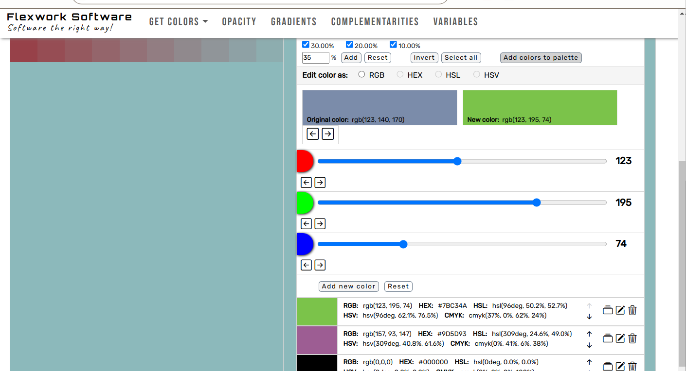
You can also click on one of the colors in the above color palette, and it will appear as the base color in the color editor. Beside the base color, you can see the color from the lower editor. Here, you can edit the chosen color and make adjustments or create an entirely new color. There are different color spaces available to work in. When you have found the color you like, you can add it to the final color palette below.
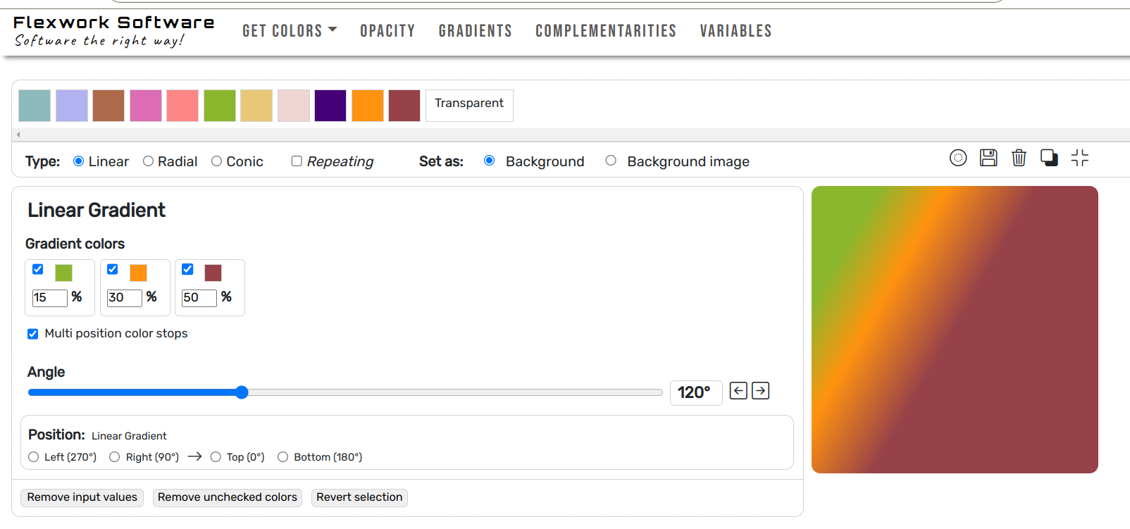
Colorworks also lets you create gradients. You can make a linear gradient by choosing a color palette and adding two or more colors to the gradient. For each color, you can specify a percentage to indicate how much space the color will fill. You can also choose to set the colors to repeat according to the percentages assigned to each color. Below the colors, you have the option to adjust the angle of the gradient. Every adjustment can be seen in the box on the right side of the screen.
At the bottom of the editor, there is a standard method to position the gradient. The only options for setting the position are in 90-degree intervals, similar to the slider above. Other positions can be achieved by using the slider.
The gradient can afterward be saved to your color palette.
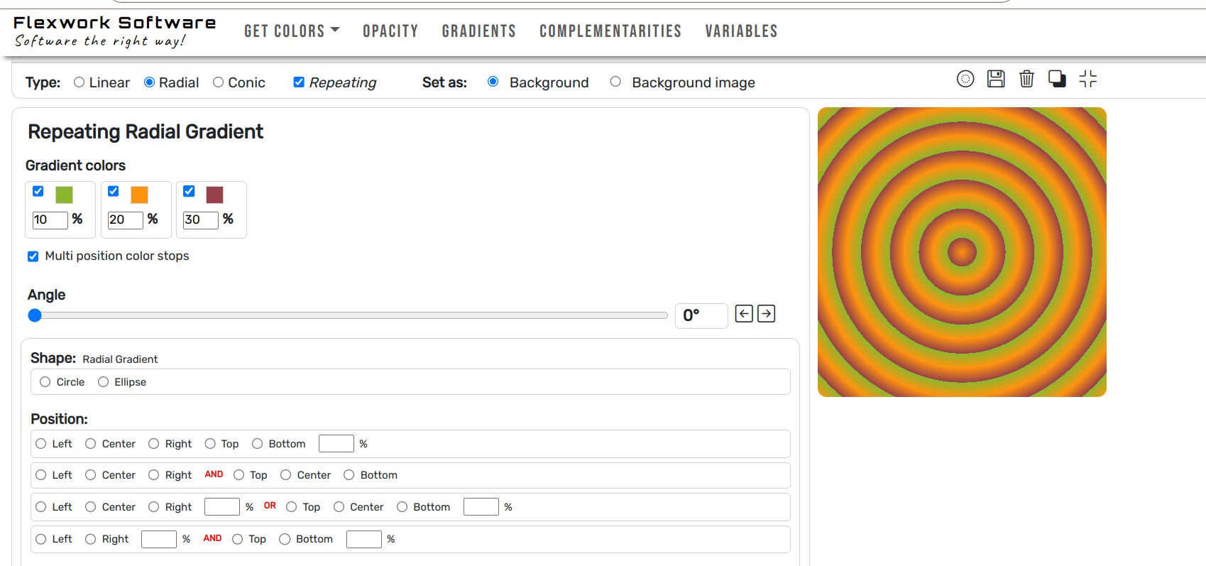
It’s also possible to create radial gradients. You do this in the same way as you create linear gradients. The only difference is that the colors will be displayed in the form of circles or ellipses.
Below the colors, you can set the shape of the radial gradient. There are two types to choose from: circles and ellipses.
Below that, there are different ways to set the position of the gradient. It all depends on how the gradient is drawn, and you can position the gradient according to the area in which it is drawn.
The gradient can afterward be saved to your color palette.
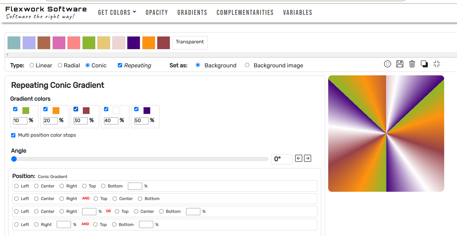
Like linear and radial gradients, the conic gradient is created in the same way by adding colors and percentages. If you set a small percentage and use the repeating parameter, you get a gradient that resembles a star.
You can set the position below and edit the rectangular color space of the gradient. You can also choose the polar color space and hue interpolation method further down, which determine how colors are used to draw the gradient.
The gradient can afterward be saved to your color palette.
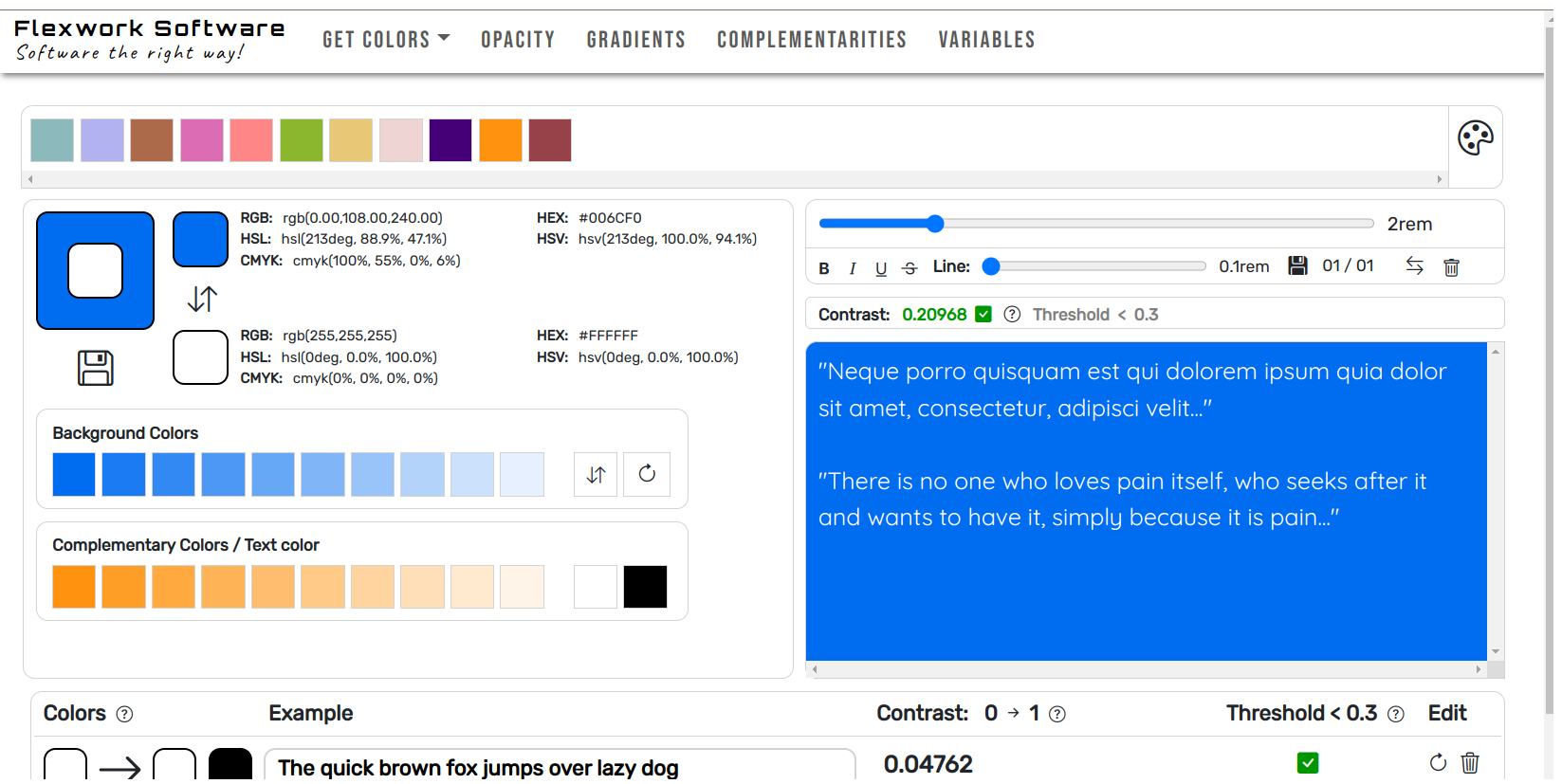
Colorworks also allows you to choose complementary colors. Here, you use colors from your color palettes, and the page will calculate the complementary colors. These colors can now be used as either background color or text color. Below the color editor, you can set the background and text color and see the contrast between the two colors.
On the left side, you can see an example of the text on the background you have chosen. The contrast can be seen above. If the contrast is high enough according to the set threshold, it will be marked in green. The contrast essentially indicates how easy it is to read the text against the colored background.
Beside the contrast, you can also set how the text is displayed. You can adjust and save the font size, font weight, and font decoration. Can you read the colored text on the colored background?
When you have found the right combination of colors, you can save it to the color palette by clicking the icon below the color combinations to the left.
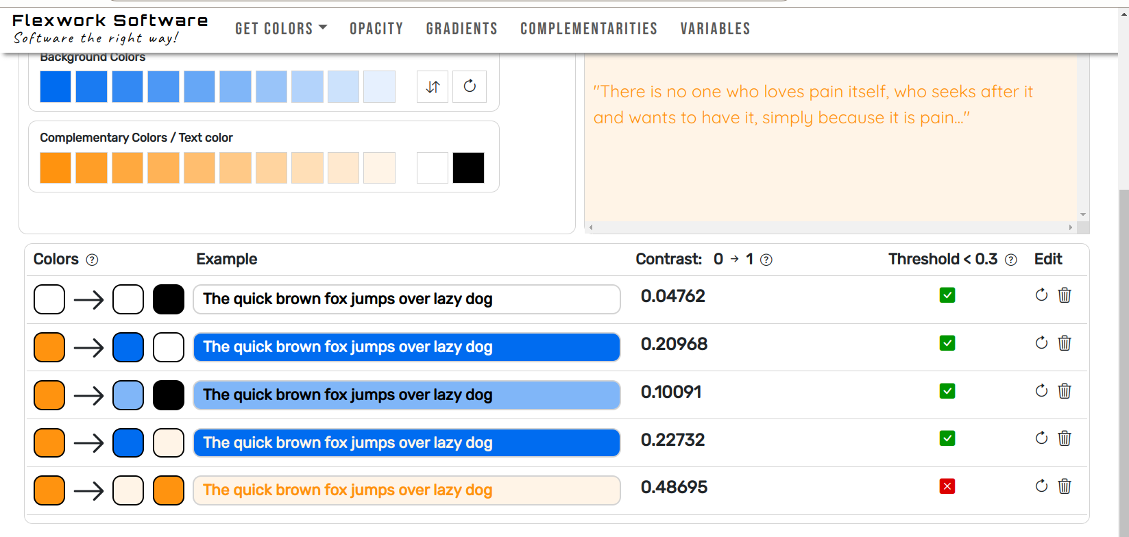
At the bottom of the page, you can see the color palette. Here, you can view the color from the palette chosen as the base color. Next, you will see the background color and text color, along with an example to show the contrast. Then, you will see the contrast number, which ranges between 0 and 1. Finally, there is an icon to indicate whether the contrast meets your threshold. You can also edit the colors here.
The colors can now be used as your color palette in other places.
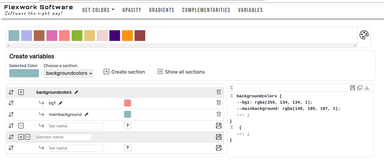
The last page is where you set your CSS color variables. Here, you choose your color palette and can add it to the variables.
The variables can be added to a section. Each section can have multiple variables. The color is set by first clicking the color in the color palette and then clicking the box with the question mark next to the variable name. You can choose a new color and change another color by clicking on it again.
After saving the section and variables, you can download a file containing the variables. These can now be used in your next project.
Web apps
Book guide
Version:
0.1-Alpha-1
0.1-Alpha-1
Demo:
Na (Under construction)
Na (Under construction)
License:
FWSoftware license
FWSoftware license
